
Table of Contents
Print Ad #1: Weight Watchers
Source: Bored Panda: Weight Watchers, 2014
The questions are presented as Annex A. The following responses are hereby presented after each print ad.
The general ambiance of the ad is very simple, formal, and structure. The mood created is perceived as humorous since the first door, labelled as ‘Entrance’ was depicted as wide to symbolize people as being overweight and obese as they initially who go through weight watching programs. After entering in that door and going through weight watching, they are ensured to fit the ‘Exit’ door which is significantly fit for thin or physically fit people.
The design featured two (2) doors of different dimensions. It used axial balance since one door at the left is matched by another door at the right. The two doors are separated by a strategically located wall.
There are few written materials, the entrance, exit, and weight watchers signs. These are enough to understand the meaning of the advertisement due to the different sizes of the entry and exit doors to signify losing weight in the process.

Space in the ad is effectively used with no white space. The only white objects seen are the doors. The remaining space is the floor.
The advertisement is taking place supposedly in an office space where two (2) doors for entrance and exit are placed.
There is no action taking place in the advertisement. The meaning lies in the interpretation of the viewers that weight watchers who enters that door would be ensured that they would be slim by the end of the program.
The textual typefaces for the entrance and exit signs are similar. The Weight Watcher’s sign with logo is situated at the center of the ad to give emphasis to the organization. Its font is also colored blue, in contrast to the light gray color of the entrance and exit signs.
The item being advertised is the service for losing weight through the weight watching program.
The socio-cultural attitude of focusing on health through staying fit and losing weight are reflected in the advertisement.
Print Ad #2: Chupa Chups
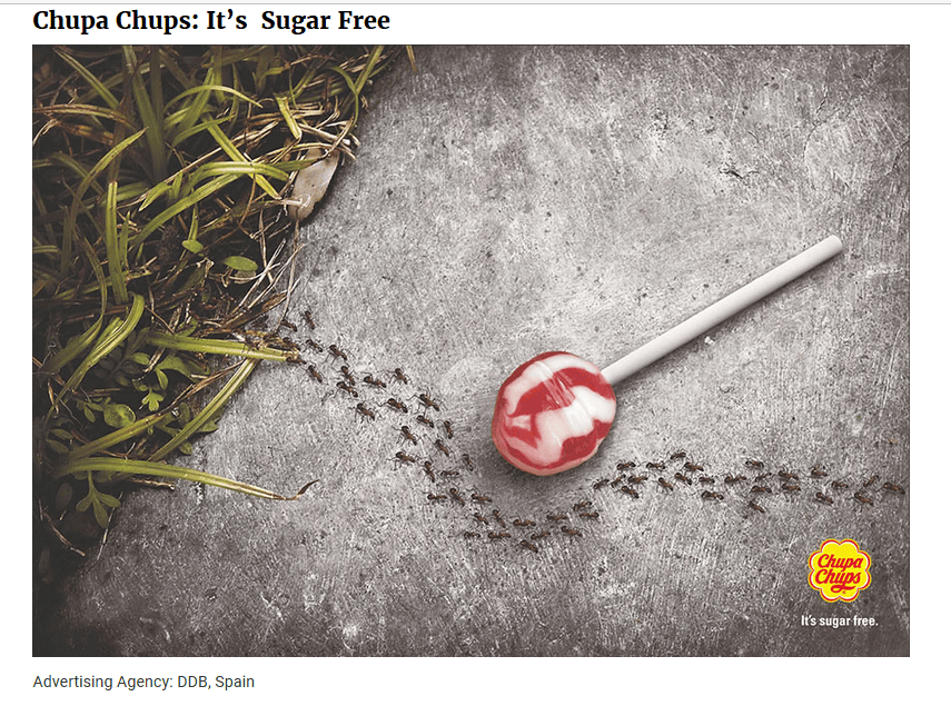
Source: Bored Panda: Chupa Chups, 2014
The general ambiance created is light, outdoor setting where a Chupa Chups lollipop, advertised as sugar free, supposedly fell on the walkway beside a grassy portion or lawn. Since it is sugar free, ants were shown as avoiding it to confirm absence of sugar.
There seemed to be some imbalance since the grassy portion was just shown on the left side of the ad; while the concrete portion predominates. The lollipop is strategically situated at the center of the ad; while the ants are effectively shown as avoiding the candy.
The only written material is shown at the lower right portion of the ad, bearing the name of the product, Chupa Chupps, and under it, the promoted message: it’s sugar free.
Space is shown in terms of emphasizing that the candy fell on the pavement; and as such, space is needed to emphasized the object being advertised. The graphic and written elements are both scarce.
The background is the concrete pavement where the product supposedly fell. It could tell that the ad was taking place in an outdoor setting and this is significant to inform viewers of the affirmation that the product is sugar free and ants are the most authoritative insects to determine the veracity of the message.
The ad actually attempts to generate humor by indicating that ants even avoid the product to affirm that it does not contain any sugar.
The ad used visual and written messages in limited; yet effective manner.
The item being advertised in the Chupa Chups lollipop which is promoted a sugar free to affirm to the relevance of advocating for good health through avoiding food rich with sugar. This would also be consistent in the health advocacy of preventing obesity, especially in children.
The socio-cultural attitude emphasizing valuing health through advocating preventive care is promoted in the advertisement.
Print Ad #3: Orion Telescopes
Source: Bored Panda: Orion Telescopes, 2014
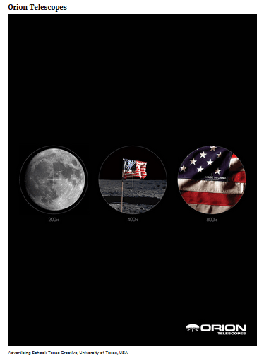
The general ambiance is initially formal, structured, and rational. The mood that is created is veering towards assisting in making logical, responsible, and informed decisions. This is enabled though emphasizing the capacities of the products being promoted, Orion Telescopes.
The design is predominantly object-focused with axial balance to emphasize the use of the telescope. The images were enhanced using different capacities to magnify details. As such, the images were depicted as seemingly seen through the lense of a telescope where the moon, the American flag, and supposedly the maker of the flag.
The pictorial elements show most of the intended message of the capacity of telescopes to magnify details. The written elements assist in making the explanations of the manner by which images were magnified 200x, 400x and 800x. Aside from these labels, the name of the product is highlighted at the lower right portion of the ad.
There is a lot of ‘black’ space which symoblizes the night sky or the actual space outside of the earth’s atmosphere. As such, the image of the moon is shown and plays an important role in the ad to indicate its capacity to search for details in far away or significantly distant places.
As such, the background tells the viewer that the product could be used in understanding spaces outside of the earth’s atmosphere. The ad could be taking place anywhere veering through the night sky.
There ad aimed to elicit some elements of humor, by finally showing in the 800x magnified detail that the American flag was supposedly made in China.
The advertisement could reflect socio-political attitudes exemplifying confidence and pride in having the American flag on the moon; yet, finding chances to include humor through the detail that was revealed.
Print Ad #4: Nivea Night
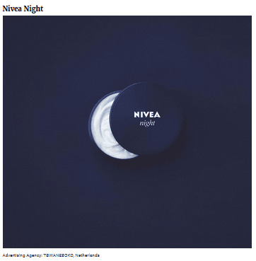
Source: Bored Panda: Nivea Night, 2014
The general ambiance created is more on formality. The mood is logical affirmation. These are created through signifying that the product being promoted, Nivea Night, resembles one of the phases of the moon, which is seen only at night.
The design is very simple. The image of the product is at the center and it is partially opened to show the cream (white) which is similar to the crescent moon. As such, it emphasizes that the product is to be used at night.
The pictorial image is the image of the product and the written material is the product (brand) name. Nothing else is written to give emphasis to the product and its intended use.
Vast space is in the advertisement to symbolise the expanse of the night sky. No other signs, symbols, or details are found in the ad.
The item being advertised is the night cream made by Nivea. It plays the role of providing aesthetic care in the American society that is focused on good health and appearance.
Socio-cultural attitude towards beauty, physical apperance, and consumption of products that enhance, maintain, and sustain good health are emphasized and reflected in the advertisement. American society has always advocated and promoted products that helps in maintining good physical appearance in conformity to societal acceptance.
Print Ad #5: Volkswagen: Precision Parking
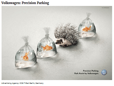
Source: Bored Panda: Volkswagen: Precision Parking, 2014
The general ambiance of the advertisement is light, enticing humor as source of appeal for the target audience. The mood that is created is happy, potentially inviting laughter. These are enabled from the use of appropriate images which recreates the context needed for precision parking.
The advertisement is designed with the use of gold fishes in small plastic packs to symbolize vehicles; while a skunk symbolized the product, Volkswagen, as having the ability to fit in precariously small spaces. There is axial balance in terms of using three (3) similar images of the fishes in small plastic packs and the sole image of the skunk to represent the product. These are arranged in a diagonal line to signify precision parking.
Aside from the indicated pictorial elements, the only written material is the texts Precision Parking and at the bottom, Park Assisted by Volkswagen, with a logo beside the texts.
There are effective uses of spaces in between the images which are just enough to give emphasis on the product and message being promoted.
The positions of the Goldfishes in the plastic packs differ from each other to symbolize disparities in vehicles which could be parked along with the promoted vehicle.
The apparent action being exemplified in the ad is the manner by which the skunk (representing the Volkswagen vehicle) could be parked in a small space and still would not endanger or pierce on the plastic packs, as indicated; meaning, the vehicle fits in small spaces and could not put other vehicles at risk.
The item being advertised is the Volkswagen vehicle, a small and compact car; and it actually plays the role of a foreign vehicle trying to attract a specific niche in the American society.
There are cultural attitudes indirectly reflected in the advertisement, especially in terms of encouraging the American consumers to purchase Volkswagen; despite the traditional preference for big and spacious cars. As such, it attempts to remove stereotyped beliefs in terms of small cars through enhancing its ability to fit in small parking spaces.
Paid Ad #6: McDonald’s Free Wi-Fi
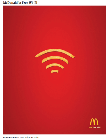
Source: Bored Panda: McDonalds: Free Wi-Fi, 2014
The general ambiance of the advertisement is fiery and bold due to the red color that it used. The mood is equally enticing alertness and inviting excitement. These are created through the effective use of colors which are synonymous with McDonald’s.
The design is very simple. It also used axial balance through positioning of the images in accurate sizes to depict the symbol of wireless fidelity or wi-fi. The message sent is clear and concisely understood through the positioning of the image (french fries), which is a popular product of McDonald’s.
The pictorial elements are the french fries, which is the only image seen in the ad. The written material is shown under the logo of McDonald’s and also wrote the words ‘love free wi-fi’. The color of the word ‘love’ is yellow, similar to the color of the logo. The text indicates that the company thinks of the welfare and interests of customers that is why they provided free wi-fi to consumers.
There is effective use of a good amount of space in predominantly red color. The reason is to emphasize the message: free wi-fi.
The symbol of the wi-fi is clearly seen through effective placement of french fries in appropriate sizes. The symbol played an important role since awareness to the symbol is a universal knowledge.
The sociological attitude being reflected in the advertisemetn is the recognition of McDonald’s for the importance of accessing the Internet by the consumers as a means to encourage them to stay and patronize their products.
Paid Ad #7: Fedex: China – Australia
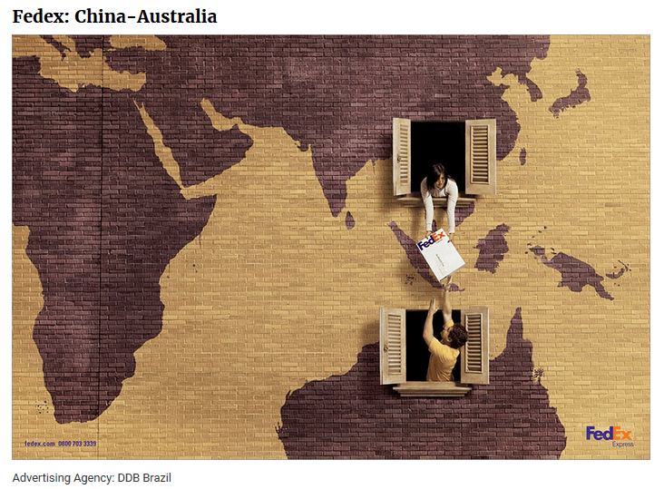
Source: Bored Panda: Fedex: China – Australia, 2014
The general ambiance of the advertisment is light, imaginary, creative to humorous. The mood that is created is optimistic with instances for capturing opportunities in the new market. The ambiance and mood are created through effectively including visual images that are easy to understand.
The design is actually simple, indicating the geographic locations of China and Australia and how Fedex makes it possible for forged alliance to send and receive parcels accordingly. It uses axial balance for including balanced images in up and down manner.
The relationship between pictorial elements and written material is clear and accurate. The images tell us that Fedex now operates in the indicated countries.
The ad effectively used appropriate spaces to contain images of the maps of these countries. As such, there is balance in spaces, graphic and written elements in the print ad.
There are figures of a man and a woman apparently reaching out to each other to hand over a parcel from China to Australia. Their faces and expressions are not clearly visible.
The action that is taking place in the advertisment, handing out the parcel, is an indication that Fedex operations extend to these countries.
The item being advertised is the service from Fedex as it extends to other geographic locations, specifically in China and Australia. The images and situations of the man and woman signify that these geographic locations are close to each other and exchange of parcels would be facilitated immediately.
There are sociological, political, economic and cultural attitudes indirectly reflected in the print ad. The extension of services to these geographic locations indicate that appropriate laws and regulations were adhered to which made it possible for Fedex to expand opertions to these countries.
Print Ad #8: Alka Seltzer: Kitten
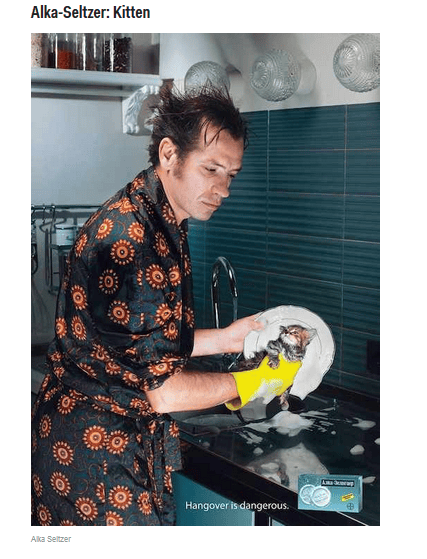
Source: Shontell & Taube: Alka-Seltzer, 2014
The general ambiance of the advertisement is focusing on humor to appeal to the viewers. The mood created is light and funny. These are enabled through using a kitten as a source of appeal to attract the attention of the target audience.
The design included images of a male person, a kitten, in a kitchen sink, while washing the dishes. There is axial balance in terms of including other objects such as jars, lighting fixtures, and other kitchen accessories, which are arranged to signify actual kitchen setting.
There is evident relationship between pictorial elements and written material in terms of the message being relayed through the text: hangover is dangerous. As such, it signified that the male person washing the dishes allegedly had a night-out by drinking alcoholic beverages where the product, Alka-Seltzer, could have been drank to prevent hangover.
There was minimum available while space in the advertisement since the background was filled with objects and images commonly found in and around the kitchen sink.
As seen, the man was still apparently manifesting signs of hangover since he did not recognize nor realize that he was washing the dish with a kitten. The kitten, on the other hand, seemed to be enjoying the mistake, and was not showing any signs of discomfort.
The item being advertised is an aspirin with antacid properties. It has been recognized to be effective in relieving hearburn and acid indigestion and has long been acknowledged to be part of the American culture as effervesent tablet remedies.
There are sociological and cultural attituted indirectly reflected in the ad, specifically in recognizing the manner by which hangovers could be treated with administration of the product. As such, the print ad actually helps in increasing awareness on other conditions were Alka-Seltzer would be considered effective.
Print Ad #9: Burger King
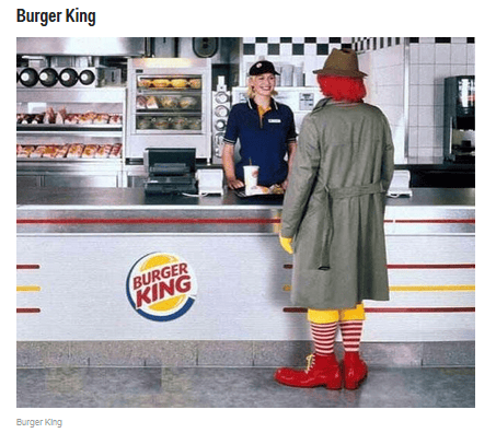
Source: Shontell & Taube, The 18 Most Hilarious And Clever Print Ads Ever, 2014
The general ambiance of the advertisement is light, funny, and imaginative. The mood
that is attempted to be elicited to the viewers include happiness, relief, and affirmation. These are made possible through the inclusion of the image of Ronald McDonald’s as unexpectedly seen to patronize Burger King.
The design of the print ad is simple and manifesting reality in contemporary contexts and settings. It used axial balance in terms of important images seen at the center of the ad: the sales person, the customer, and the Burger King logo.
There are effective relationships between pictorial elements and written material in terms of including only the essential components to relay the intended message. Actually, the only written material in the ad is the name of the fastfood chain, Burger King.
The use of space was evident in terms of avoiding white space. The rest of the background is full of images expected in a Burger King chain.
There are figures of a man (Ronald McDonald’s whose image does not face the viewers and is apparently wearing a coat to partially disguise his identity), the woman is the sales personnel whose facial expression exemplified providing effective customer service.
The background tell us that the setting is inside a Burger King store complete with food displays.
The action that is taking place in the advertisement is actual purchase of the customer and its significance is emphasized in terms of indicating that Burger King products must be better than what McDonald’s offer since even Ronald McDonald’s patronizes them.
There could have been sociological and cultural attitudes indirectly reflected in the advertisement since only those who are familiar with Ronald McDonald’s would recognize him and would respond appropriately to the intended meaning and message that was being relayed.
Print Ad #10: Raid
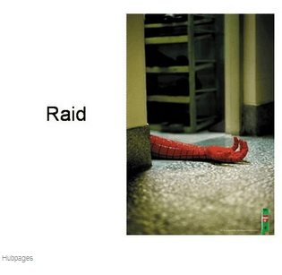
Source: Shontell & Taube, The 18 Most Hilarious And Clever Print Ads Ever: Raid, 2014
The general ambiance is actually morbid since it is shown that a globally recognized super hero, Spider Man, falls dead in the floor. However, the mood that is attempted to created is light and funny since it indicates that the product, Raid, is so effective that it is able to kill all insects and bugs, including Spider Man, which would be interpreted as an oversized insect.
The design of the advertisment is simple and in real life context. There is axial balance used in terms of positioning the arm of Spider Man on the center, and in between two door posts. An open file with images could also be seen at the background.
The only space that seemed to be categorized as white space is the floor. At the lower right side, the image of the product, Raid, could be seen. No other textual messages are contained in the ad.
The background tell us that the advertisement could have taken place in an indoor setting, a residential house, perhaps. The significance of the background is the product’s use and appliciability on various settings and contexts.
The item being advertised is an insect spray and repellant and the role that the product plays in American culture and society has been accepted and recognized in terms of contributing towards ensuring safety in the environment, especially warding off mosquitoes, cockroaches, insects, and bugs.
There are sociological and cultural attitudes which are indirectly reflected in the advertisement, especially in terms of perceiving the product as safe in the environment. It apparently contains chemicals which could be hazardous to health. However, the ad aims to elicit humor as a means of appeal to attract customers and encourage patronizing the product.
- Bored Panda. (2014). Chupa Chups: Its Sugar Free.
- Bored Panda. (2014). Fedex: China – Australia.
- Bored Panda. (2014). McDonald’s: Free Wi-Fi.
- Bored Panda. (2014). Nivea Night.
- Bored Panda. (2014). Orion Telescopes.
- Bored Panda. (2014). Volkswagen: Precision Parking.
- Bored Panda. (2014). Weight Watchers.
- Shontell, A., & Taube, A. (2014, April 8). The 18 Most Hilarious And Clever Print Ads Ever.
- Shontell, A., & Taube, A. (2014, April 8). The 18 Most Hilarious And Clever Print Ads Ever.
- Shontell, A., & Taube, A. (2014, April 8). The 18 Most Hilarious And Clever Print Ads Ever: Raid.